June 2nd, 2021
A Tactical Position:
The Science Behind Great Design
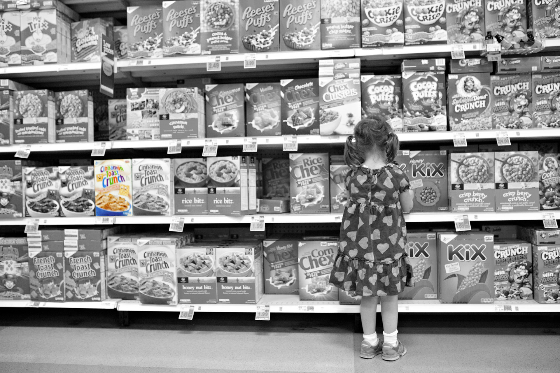
We have hundreds of choices on everything nowadays. Whether its flavors of ice cream, hair products, service providers or creative agencies (trust me, we know) consumers have an insurmountable number of options available to them at any given moment. As a consumer, this is incredibly daunting – how the hell do I know whether I should go with this hair cream over the next? If you’re advocating for volume, you’re not really narrowing down my choices here. I am begging you, make this choice easier for me and alleviate the pain that comes with making a decision.
Enter the well positioned business. My hero.

Brandish Insights
What do they mean when they say brand?
The word brand is often used by marketing professionals to describe a company’s outward facing presence. It is the visual identity of a company, such as the logo, colors and photography that creates a specific appeal to its customers. The more intentional a business is in the development of its brand, the more deliberate it can be with its customer base. Is there a certain segment of your customer base that you’d like to appeal to? Would you like to offer a new line of products that appeals to a specific set of values? A well positioned brand with consistency in its presence will do this in spades, creating brand loyalty along the way.
Knowledge Worth Sharing:
Malcom Gladwell’s musings on choice, marketing and happiness.
On the topic of psychology in marketing and solid positioning, we wanted to share this excellent TED talk from best selling author Malcom Gladwell. In the video, he discusses the nature of choice and the significance of determining how brands differentiate their offerings through a fascinating case study on the food industry.

Case study
Bee-Nails
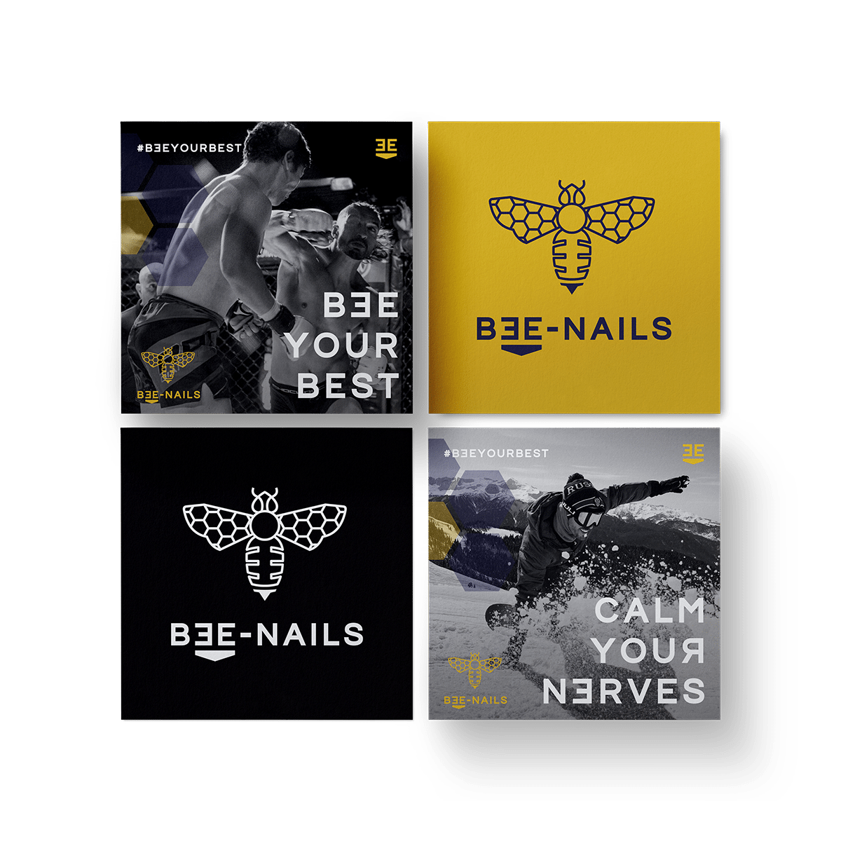
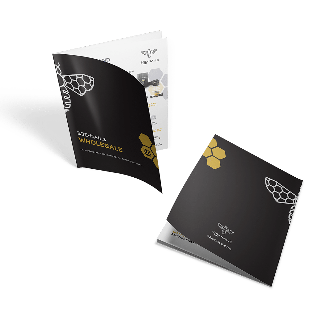
As we worked through the new brand, we landed on a color scheme of black, gold, purple and white. The black and white allows Bee-Nails a lot of flexibility in depicting the lifestyle brand through vibrant photography that won’t clash with the Bee-Nails aesthetic. The gold gives a premium quality, emblematic of honey, dabs and affluence. It indicates a strong synergy between the bee, the product and the values that Bee-Nails has instilled into its brand. The final color choice was purple, complementing the gold and further reinforcing the values behind the brand. Purple has commonly been associated with royalty, which also holds a double meaning in the case of the Bee-Nails brand. Bees have many terms associated with them that represents royalty.
Conquer your challenges, bee the best at the arenas you compete within and become the king or queen of your life. This is the potential that Bee-Nails provides to its customers, with a strong brand to represent those ideas. As we worked further into the project, Bee-Nails went a step further with its goals here and implemented a new service that would be included on its redesigned website – The Bee Your Best Program.


Let's Talk.
Through our process, we deliver elegant company image through lasting relationships with our clients. If you're looking for growth by design, we want to hear from you.
Insights about Branding & Marketing Strategy
Show off your brand with pride. Get marketing tips that will help you stand out from the competition, straight to your inbox.